
September 5 | One Hot Jobs Number, and Seven Charts Explained
September 5, 2026
Good morning, beautiful community!
I’m sharing this material for free today to give you a better idea of what you receive as a subscriber. These reports take a significant amount of time and work to put together, and I usually share them with the community once a week, sometimes twice.
The subscription is currently $25/month until early November, when it will increase to $30/month for the Market Update Tier and $60/month for the Beta Tier. I believe the work I put into these reports deserves that adjustment, and I want everyone to have the opportunity to see the value before deciding.
The goal is not just to give you information, but to help you understand how to act, where opportunities may exist, and where market panic or misinterpretation can create an advantage.
We saw a great example with IREN recently. We added that position at $36, during a period of panic that I believed did not reflect a real reason for concern. Just one week later, we’re looking at returns of more than 25% on that position.
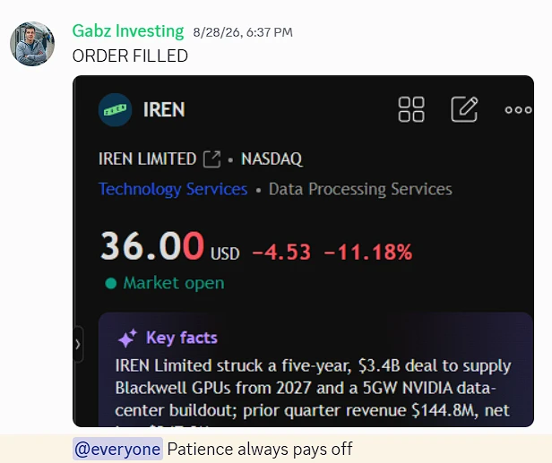
That’s the kind of opportunity I want to help you identify—not by chasing the market, but by understanding it.
If you’re curious about what the community receives, this is a good example of the work that goes into it.
Now, let’s take a closer look at today’s market update…
It’s the weekend, I’ve got my coffee, and I’m sitting here going through the charts one more time before the week starts. I want to walk you through exactly what I’m reading, in plain words, because yesterday gave us a number I did not want to see, and I think the honest thing to do is talk about it openly instead of pretending.
So let me start there.
The jobs report came in the opposite of what I hoped for
On Friday I told you I’d rather see a soft jobs report. Fewer jobs, unemployment ticking up a little. That kind of report keeps the Fed calm and takes a rate hike off the table.

We got the opposite. The US added 162,000 jobs in August, the strongest in five months, and roughly three times what the market expected (around 53,000 to 56,000). Unemployment held at 4.1%. And here’s the part that stings a little: July, which first printed as a loss of 23,000 jobs, was revised all the way up to a gain of 21,000. June and July together were bumped up by 55,000.
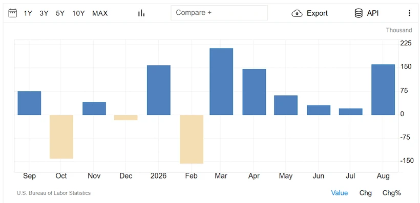
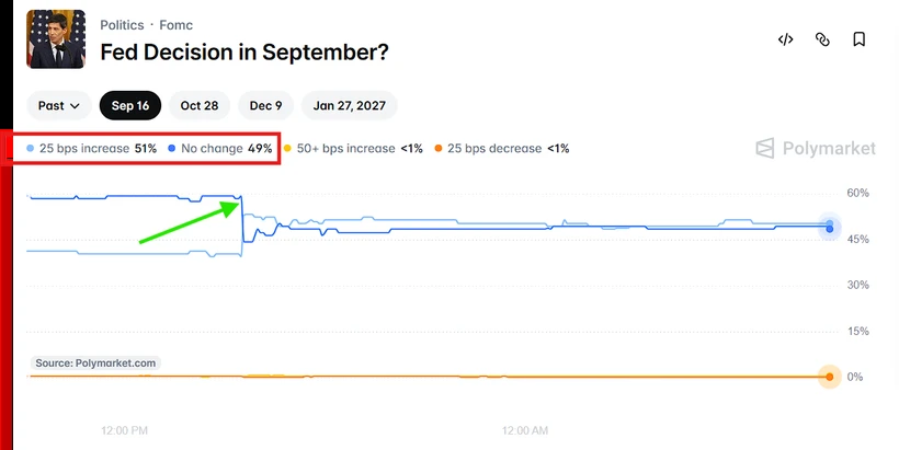
I’m not going to spin this. A hot number like this makes a September rate hike more likely, not less. Right after the report, the market’s odds of a hike jumped from around 55% to about 65% for the meeting on September 15–16. So the thing I’ve been saying for weeks, that the Fed doesn’t hike, is now under real pressure. I still lean that way, but I have to respect what the data did.
This morning’s chart is showing almost 50/50 chances of a 25 bps rate cut and no change. As I’ve stated before, I think rates will remain unchanged.
Two things keep me from panicking, though.
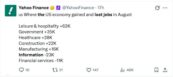
First, look at what kind of jobs these were. The gains came from restaurants and bars, local government schools, and health care. Solid, but not exactly the high-value engine of the economy. And here’s the quiet detail almost nobody is highlighting: the information sector actually lost 23,000 jobs, in computing infrastructure, data processing and web hosting. That’s the tech corner of the labor market shrinking, likely because companies are spending on AI instead of people. So the headline is hot, but the mix is softer than it looks.
Second, this isn’t the number that decides it. Even the economists calling this strong are saying the same thing I am: next week’s inflation data is what really matters. We get PPI and CPI Thursday and Friday. If inflation comes in cool, the Fed can look at this jobs report and calmly set it aside. That’s the real fork in the road, not Friday.
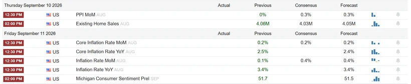
Now let me zoom out, because when I stop staring at that one number and read the whole board, the picture is a lot calmer.
Chart 1: yields usually fall into year-end
There’s a Bloomberg chart going back to 1962 that shows how the US 10-year yield tends to move each quarter. The third and fourth quarters are seasonally the weakest for yields, meaning they usually drift lower, not higher. On average, both quarters have pulled yields down by around 10 basis points.
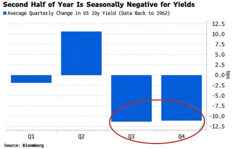
Why do I care? Because yields are the cost of money, and lower yields are oxygen for stocks. The jobs report pushed yields up on Friday, but the seasonal tide for the rest of the year usually leans the other way. One strong report doesn’t cancel that. It’s a good reminder not to extrapolate a single day into the whole autumn.
Chart 2: protecting the big names is cheap right now
There’s a measure of how expensive it is to buy downside protection on the Magnificent 7 (basically insurance against a drop). Right now that reading is low, near the bottom of its range. In plain terms, hedging the giants is cheap at the moment.
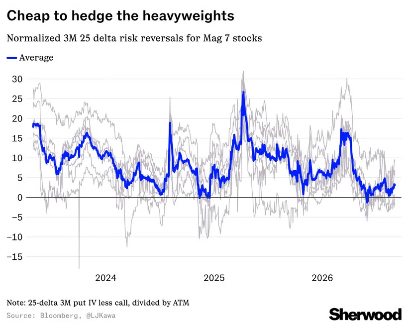
I read this two ways, and I want you to hold both. On one hand, if I ever wanted to protect a position, it’s a cheap moment to do it. On the other hand, cheap protection means very few people are scared — nobody’s rushing to buy insurance. That’s usually a calm market, but calm markets are also the ones that get caught off guard. I’m not buying protection, I don’t trade options, but I’m filing this away as a sign of how relaxed everyone is right now.
Chart 3: this is the one I keep coming back to
This chart matters most, so read it slowly. It looks at how the S&P 500 behaves around the Fed’s first rate hike, split by how fast the Fed moves.
The pattern is clear. When the Fed hikes fast (roughly every other meeting), stocks are weak a year later, down about 3.6% on average. When the Fed hikes slow, or just once or twice and stops, stocks are up nicely, around 10% to 11% a year later. And near the start, before anyone knows which type of cycle it is, stocks tend to wobble and pull back until the market figures it out.
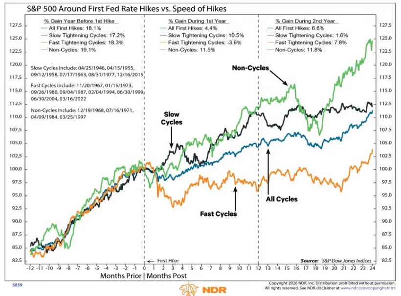
So here’s my honest read. If the Fed does hike this month, the whole game is whether it’s a fast cycle or a one-and-done. I strongly believe it is not a fast cycle. There’s no world where this Fed hikes every other meeting from here. If I’m right that this is slow or one-and-done, history says the pullbacks along the way are buying opportunities, not the start of something ugly. That single distinction is the difference between fear and patience.
Chart 4: low VIX on Labor Day is not the curse people think
The VIX (the market’s fear gauge) closed under 15 on Labor Day, at 14.56. A lot of people treat a sleepy VIX as an automatic warning that a crash is coming. So someone pulled every year since 1990 when the VIX was under 15 on Labor Day. This is the 13th time.
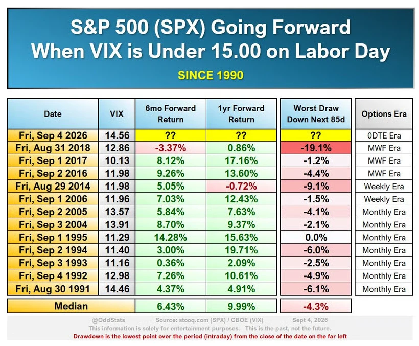
The history is reassuring, not scary. On average, six months later the S&P was up about 6.4%, and a year later about 10%. The worst drop along the way was around 4%. So yes, a quiet VIX can mean complacency, but the actual track record says low fear going into fall has usually been fine, with only modest bumps. I’m not going to be scared of calm just because it’s calm.
Chart 5: in software, “we use AI” isn’t enough anymore
This one is a lesson for how we pick names. There’s a great chart of software stocks this year, and the spread is huge. Security names like Palo Alto, Fortinet, Okta and CrowdStrike are up 80% to 95%. Data names like Snowflake and Datadog are up nearly 60%. But a whole pile of others, including Intuit, HubSpot and Adobe, are down double digits.
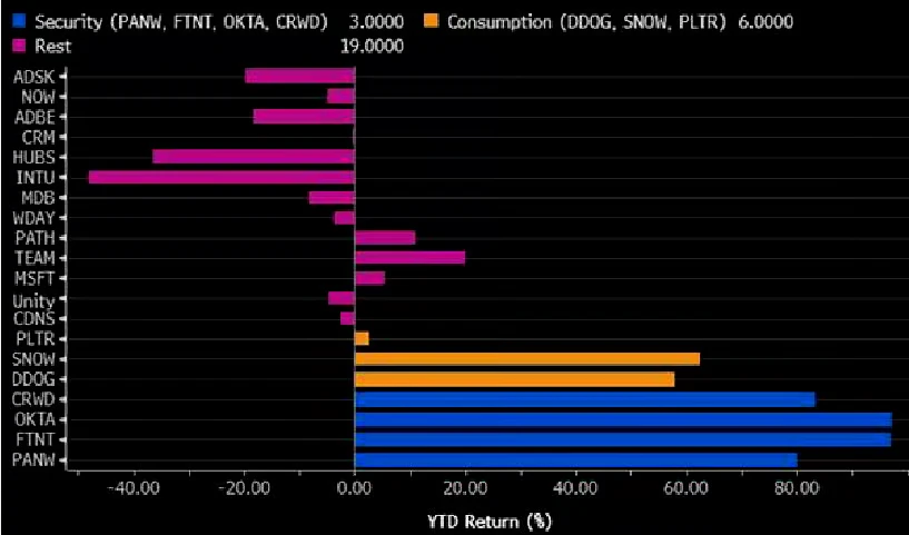
The message is simple: slapping “AI” on the story doesn’t move the stock anymore. Investors now want to see it show up in the actual numbers — more usage, bigger contracts, customers expanding. Without real revenue reacceleration, a cheap valuation alone won’t rescue a name. So in software I’m being picky. I want proof the AI is being used and paid for, not just talked about.
Chart 6: semiconductors look cheap here
South Korea’s exports have been one of the most reliable real-world signals for where semiconductor stocks go, because Korea sells so much of the world’s chips and memory. Right now Korean exports have surged, but the semiconductor stocks haven’t caught up. The gap suggests hardware and chips are at least 50% undervalued relative to what the export data is signaling.
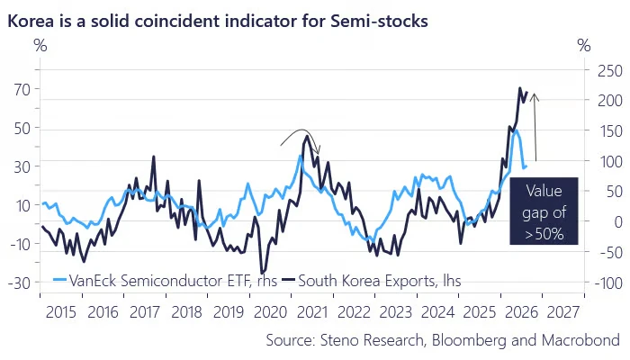
This lines up with what I’ve believed for a while. The AI trade is rotating toward the physical layer — the chips, the hardware, the machines — and this chart says that layer is lagging where it should be. That’s where I’m leaning.
The index itself just confirmed the power thesis
Here’s the piece that made me smile. In the S&P 500’s quarterly reshuffle, effective September 21, three names are being added, and one of them is Bloom Energy (BE) — a company that makes fuel cells, that is, on-site electric power. Its stock is up more than 190% this year, on demand from AI data centers and big power-supply deals. It jumped another 7.5% after hours just on the news of joining the index, because index funds now have to buy it.
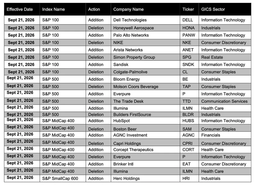
Think about what that means. The S&P 500 is literally adding a power company because of AI electricity demand. I’ve been telling you for months that electricity is the real bottleneck of the AI build-out, that the picks-and-shovels of this cycle are power and grid, not just the chatbots. When the index committee reshapes the S&P 500 around that idea, that’s not my opinion anymore. That’s the market writing it down in ink. (Illumina rejoining on the healthcare side is a smaller story, more about a comeback than a theme.)
So what am I actually doing with all this?
Let me tie the whole weekend together, because it does add up to one clear posture.
The jobs report was hot, and that raises the odds of a rate hike and the odds of a near-term pullback. I take that seriously. But everything else I’m reading says the bigger trend is intact: yields tend to ease into year-end, fear is low, low VIX historically hasn’t been a curse, and the only scary version of a rate-hike cycle is a fast one, which I don’t think we’re in. Under the hood, the real opportunity is shifting toward semiconductors and power, and the index just validated the power call by adding Bloom Energy.
So here’s my plan, same as always, just sharpened:
- Don’t overreact to one number. Next week’s inflation data is the real decider. Watch CPI and PPI, not Friday’s headline.
- If a hike scare gives us a dip, that’s the gift. History says the wobble around a slow or one-and-done cycle is where patient buyers get paid.
- Lean into the physical AI layer — chips and power look better positioned than the crowded software trade.
- In software, be selective. Reward the names showing real usage and revenue, ignore the ones just wearing an AI costume.
- Keep cash ready and keep DCAing into conviction. No leverage, no panic, no chasing.
One hot number made a lot of noise on Friday. Seven quieter charts are telling me to stay calm, stay patient, and keep buying quality on the dips. That’s the whole job.
See you in the week, eyes on the inflation data, hands steady.
Update: the Discord trial is now live. You can now try the full Discord community free for 24 hours — every channel, including SuperTrend signals, portfolio moves and the private members chat. Sign in with Discord and you are in instantly.